The TVA Set Design Decoded: Every Hidden Detail In Loki's Retro-Bureaucratic Nightmare
Brutalist concrete, 1970s office furniture and an animated clock with a Southern accent. The TVA is the MCU's best-designed set, and every choice in it means something.

Loki has the strongest production design in the MCU, and it is not close. Kasra Farahani's Time Variance Authority is built out of mid-century corporate architecture, brutalist concrete, analogue computing and the visual grammar of institutional boredom, and every single one of those choices is load-bearing. The joke is that the organisation policing all of time runs on paperwork. The horror is that it works.
The architecture is the argument
- Ceilings are absurdly high and lighting is uniformly flat, so nobody in the TVA ever casts a meaningful shadow. Individuals do not matter here.
- Corridors run long and straight with repeating modular panels, which makes the building feel infinite without ever showing you an exterior.
- The colour palette is restricted to burnt orange, avocado, ochre and concrete grey, the exact range of a 1970s municipal building.
- Every workstation is analogue: CRT monitors, pneumatic tubes, physical files, mechanical switches. There is no touchscreen anywhere in the organisation.
- The Time-Keeper statues loom over the lobby in the manner of civic monuments, which is what makes their eventual reveal as animatronic props land.
The pneumatic tube system is the detail that best explains the whole design philosophy. An institution capable of pruning entire timelines with a stick moves its paperwork through pipes. The technology gap is deliberate: the TVA does not need to be sophisticated because it has never been challenged.
Miss Minutes and the corporate mascot tradition
Miss Minutes is drawn in the style of 1950s and 60s American corporate and educational animation, the kind of cheerful cel-animated spokes-character used to explain nuclear safety or savings bonds. Her presence in the orientation film is the show's cleanest joke: the most sinister organisation in the multiverse onboards you with a cartoon. That she later turns out to be genuinely dangerous is set up entirely through her design register never changing.
The TVA's onboarding video is a cartoon. Its execution device is a stick. Nothing about this organisation is designed to look powerful, which is precisely why it is.
The comic-book roots
| Element | Comics origin |
|---|---|
| The Time Variance Authority | Created by Walt Simonson, first appearing in Thor in 1986 as a bureaucratic time-policing body |
| Mobius M. Mobius | A comics TVA functionary named for the Mobius strip, and drawn in the likeness of editor Mark Gruenwald |
| The Time-Keepers | Comics entities overseeing the timestream, here revealed as a fiction |
| Alioth | A time-eating entity from the comics' Kang mythology |
| Ravonna Renslayer | In the comics, a love interest and antagonist tied to Kang |
| He Who Remains | A comics designation for a Kang-adjacent figure at the end of time |
The naming is the deep cut. In the comics, the TVA's endless identical clerks are all drawn to look like Mark Gruenwald, the Marvel editor famous for obsessive continuity policing. Making the time bureaucracy look like the man who kept Marvel's continuity straight is one of the great in-house jokes in comics, and the show inherits its spirit even though it casts Owen Wilson.
The Void, and the props buried in it
The wasteland at the end of the Sacred Timeline is a set-design showcase in its own right, and the recognisable debris is verifiable rather than rumoured because the production has discussed it.
- The Thanos Copter, a genuine 1979 Spidey Super Stories artefact in which Thanos flies a helicopter with his own name on it, sits in the wreckage.
- Throg, the frog of thunder, appears trapped in a jar with a tiny Mjolnir. He is a real comics character created for Walt Simonson's Thor run.
- A Yellowjacket helmet and assorted MCU hardware are scattered through the landscape.
- A Sanctuary-class ship's hull and the remains of a Statue of Liberty-scale structure provide the scale reference.
- Roxxon branding, the MCU's evergreen fictional oil company, appears on wreckage, as it does in Iron Man 2, Agent Carter and Daredevil.
The Void's function is the same as the TVA's: it is a landfill. Everything the organisation cannot process gets thrown somewhere and forgotten, which is exactly the reading Deadpool & Wolverine later ran with when it filled the same wasteland with cancelled film franchises.
Season two: the machine gets a body
Season two adds the Temporal Loom and Ouroboros, the TVA's forgotten engineer, and the design work does something clever with both. The Loom is enormous, mechanical and visibly straining, a piece of Victorian industrial machinery scaled to hold the multiverse. O.B.'s workshop is buried below the organisation and full of the manuals nobody read. The TVA's central technology is a machine its own staff had stopped thinking about, maintained by one man in a basement.
- The TVA Handbook is a real prop, written and printed, and the show treats it as both a joke and a plot solution.
- The Kang statue that replaces the Time-Keepers at the end of season one changes the lobby's entire meaning without changing its architecture.
- The 1970s Chicago automat and the Broadway sequences are period-correct rather than stylised, which grounds Victor Timely's introduction.
- Hunter designations, B-15, D-90, K-5E, are stencilled rather than printed, another analogue tell.
What we left out
Frame-by-frame Void inventories circulate claiming dozens of additional identifiable objects, including several tied to properties Marvel did not control at the time. We have listed only items that are clearly identifiable or that the production has spoken about. The Thanos Copter and Throg are on the record; a lot of the rest is wishful pausing.
For where all this design work eventually leads, our Loki season 2 ending explained covers the finale, and the Deadpool & Wolverine easter egg guide tracks how the Void was reused.
Frequently asked
Who designed the TVA in Loki?
Is the Time Variance Authority from the comics?
What is the Thanos Copter in the Void?
Why does the TVA use such old technology?
Characters in this story
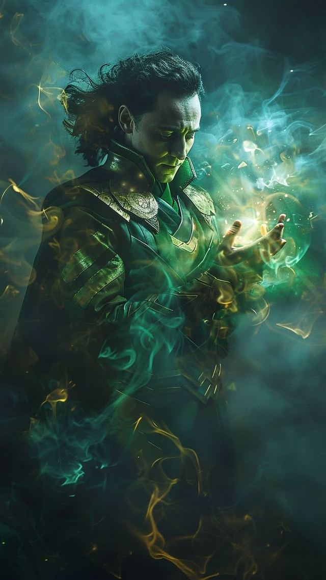
Loki
Loki Laufeyson
Mobius M. Mobius
Mobius M. Mobius; on Earth, Don
Sylvie
Sylvie Laufeydottir
Kang the Conqueror
Nathaniel Richards
Catching up on the MCU? See where this fits on our full timeline.
Read next
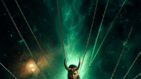
Loki Season 2 Ending Explained: The God Of Stories, The Broken Loom And What Loki Actually Became
Loki does not fix the Temporal Loom. He destroys it and replaces it with himself. Here is what the God of Stories…
Inside The Sanctum Sanctorum: The Hidden Details, Relics And Comic References You Walked Past
177A Bleecker Street is the most detail-dense set in the MCU. Here is what is actually on those shelves, and the…

Deadpool & Wolverine Easter Eggs: Every Cameo, Fox Callback And Void Deep Cut
A film built entirely out of references to films that no longer exist. Here is every verified cameo, Fox-era…